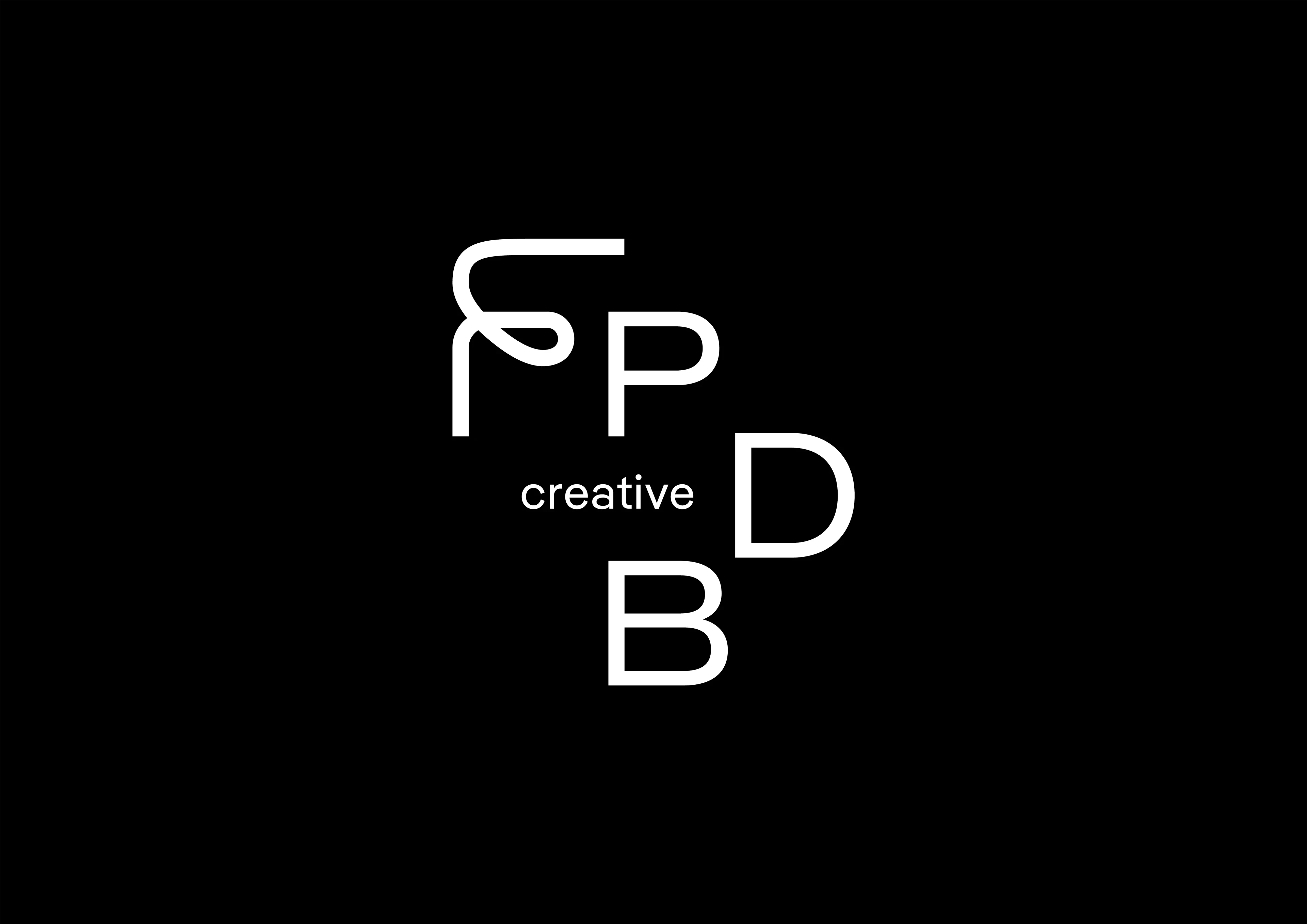
FPDB Creative

Client

FPDB Creative

Year

2021

Scope

Brand Design

Location

Ho Chi Minh City. Vietnam

Industry

Creative

FPDB

The stylized “F” represents the brand's Food First approach, the starting point of every FPDB photography project. Its freeform contrasts with geometric letters, implying creativity and professionalism. And a subtle nod to sauce plating. 

The intentional staggered composition breaks up similar-sounding letters and helps with comprehension. 

In other words, FPDB ≠ FBDP.

We created a series of food emojis and embedded them into the brand font system as glyphs so every employee of FPDB—even creatively-challenged ones—can express the brand's love of food.

We created a series of food emojis and embedded them into the brand font system as glyphs so every employee of FPDB—even creatively-challenged ones—can express the brand's love of food.

TEAM


Creative Director: Tuan Le
Sr Graphic Designer: Tuan Ha
Jr Graphic Designer: Khe Nguyen
Photographer: FPDB Creative
Accounts: Huyen Vo, Anh Nguyen, Duy Lam

Motion Designers: Tuan Le, Tuan Ha

Documentation: Tuan Ha

Frequently Asked Questions

A

2 Le Ngo Cat, Xuan Hoa Ward, HCMC

E

team@thelabsaigon.com

Frequently Asked Questions

A

2 Le Ngo Cat, Xuan Hoa Ward, HCMC

E

team@thelabsaigon.com

2025 © The Lab Co., Ltd.

Frequently Asked Questions

A

2 Le Ngo Cat, Xuan Hoa Ward, HCMC

E

team@thelabsaigon.com

2025 © The Lab Co., Ltd.