Tin Men Capital Podcast: Unfair Advantage
Client
Tin Men Capital
Year
2025
Scope
Brand Design
Location
Singapore
Industry
Finance

Tin Men Capital Podcast: Unfair Advantage
Tin Men Capital’s new podcast, Unfair Advantage, explores how founders, investors, and enterprise leaders across Southeast Asia build and sustain their edge. Each episode connects the dots on what truly drives B2B growth within the region’s fast-evolving innovation ecosystem.
To reflect this fresh perspective in the venture capital world, we developed an intro video for the podcast, inspired by the podcast’s ability to unlock new doors for founders and investors alike. Moving away from the sterile, clean-cut aesthetics typical of the tech industry, the intro video embraces a human and whimsical tone, which is also what we found unique about the Tin Men Capital team, a community-driven team of experts.
The visual identity balances this approachability with expertise, pairing friendly, hand-drawn strokes with the clean typography and structured layouts. Our color palette takes cues from the signature produce and exports of Southeast Asia, creating a vibrant and culturally resonant system. We also developed a dynamic motion system based on the movement of opening doors, a motif that translates across typography, imagery, and video assets.
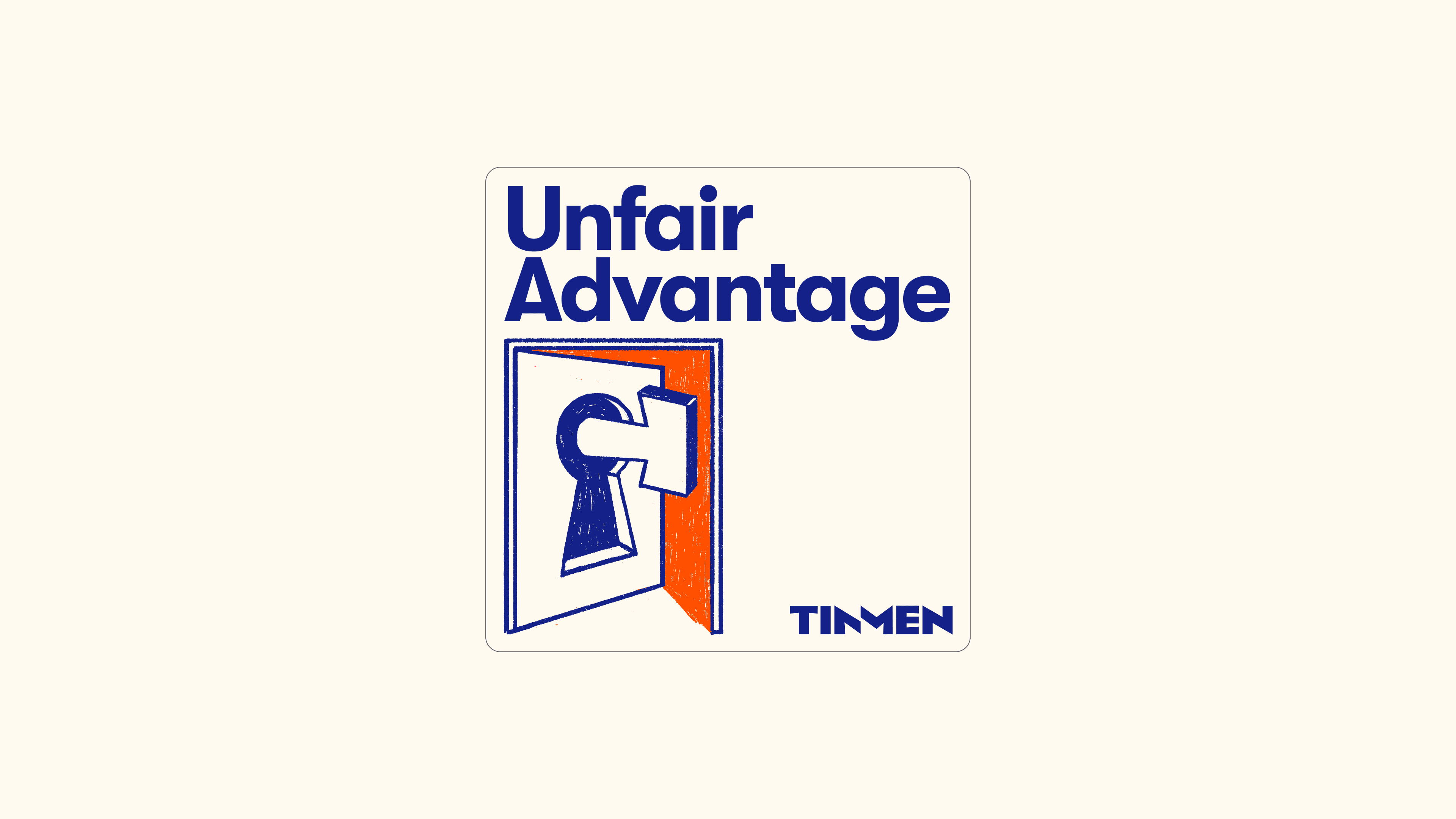


TEAM
Brand Design: Giang Ho, Ven Bui
Strategic Partnership: Nhi Nguyen
Motion Design: Quang Do
Tin Men Capital Team: John Tay, Gwen Sim

